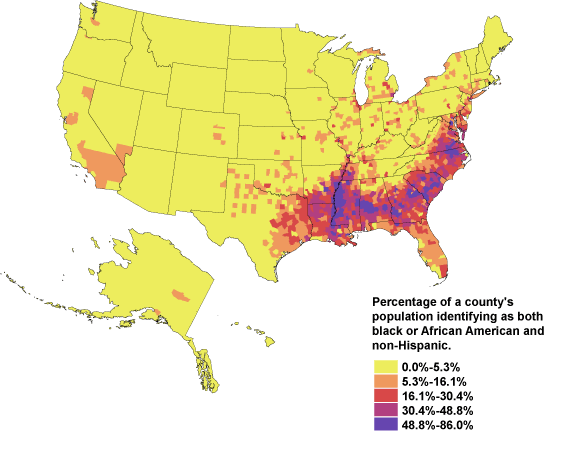
Where are the Blacks?
 Seriously, I'm sure there are a billion things that could be deduced from the picture above, but this really makes me want to do some legitimate research. Maybe that JHU degree will come in-handy after-all.
 Just think about how cross-referencing this map with this map with this map with this map might make your head spin.
And if you thought the map of where Black people reside in the U.S. is thought-provoking, then this map of nuclear families across the country might interest you too. And to think if only the census bureau cared enough to cross-reference some of this data and present it. I'm sure some organization/person out there has taken the time to do this, right?
Needless to say at this point (but Imma still say it), I strongly recommend taking a look at censusscope.org.

2 comments:
The census is interesting in it's own right. I believe I cross referenced some of these (or other) maps for a paper a few years back... It will make your head spin for sure.
Just looking at the correlation between some of these maps is enough to make you think. Sad that this alone isn't enough to spark people to initiate change in our local and federal governments.
Post a Comment